Fortnight Collective's Rebranding Campaign for Solely Fruit Jerky
Feb. 10, 2026
Fortnight Collective, the independent advertising and branding agency, recently launched a rebranding campaign for Solely, including a brand repositioning and redesigned packaging.
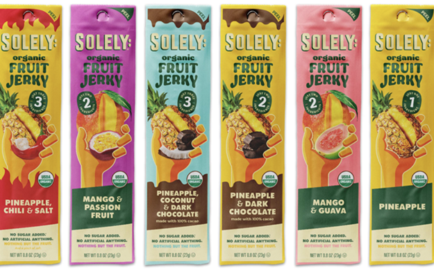
Solely launched a major packaging rebrand for its Organic Fruit Jerky and snacks, designed to emphasize ingredient simplicity and improve shelf impact. The redesign, which has contributed to a 296% sales boost and earned a 2025 Designalytics Effectiveness Award, streamlines communication by focusing on "nothing but the fruit" and removing, in some cases, previous "one whole fruit" messaging and specific, redundant or excessive, badges.
Andy Nathan, founder and CEO, Fortnight said:
“We saw that Soley had many strong advantages in the marketplace, but its messaging and the packing and visual ID were not consistent or clear. They needed a new, compelling and crisp articulation of the brand idea/platform—Nothing But the Fruit—that would unify the company’s marketing strategy, package design and creative execution.”
Fast Company ranked Soley its #2 Most Innovative Food Company in 2025 and both agency and client saw the enormous growth opportunity for a brand with such a disruptive and innovative position in the market – especially when consumers raved about the brand’s taste experience.
Nathan added:
“We needed to establish Solely as a distinct, revolutionary force driving the food industry forward. Our mission was to increase brand awareness and relevance and ramp up consumer trial and adoption. The first and most important line of attack was the product packaging.”
Fortnight introduced a complete, top-to-bottom redesign of the packaging, in collaboration with Bex Brands. The new packaging scheme is centered by a more recognizable hand that holds dramatic and realistic illustrations of radiant and glowing fresh fruit that have been sliced open to reveal the fresh, natural abundance of the fruit inside. The color palette is dominated by bright, saturated main colors that reflect the character of each fruit and the wording has been reduced to focus on the brand name and the variety. The redesign template has been adapted to the fruit gummies and dried fruit products—and the brand continues to roll out more exciting varieties.
The new packaging and visual ID now accurately and dramatically express the Soley brand narrative, “Nothing But The Fruit,” and reinforce the brand’s unique position in the category, the integrity of its products and the total transparency of the brand’s mission--expressed in the clear wrapping on the back of each package that shows off the fruit in its purest form.
Related News
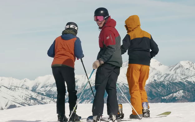
Sun Valley Hands the Camera to the Mountain Community in Latest "Ski on the Sunny Side" Ad Campaign
The campaign runs from August through April 2027 across video, social, out-of-home, digital banners and email

Peter Alsante Joins Fortnight Collective as Chief Creative Officer
Creative vet brings a passion for brands and a history of business wins and creative awards
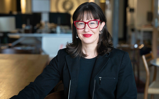
Fortnight Collective Promotes Sam Emrich to Head of Strategy
Over the last two years, Emrich has built and scaled Fortnight’s strategy function from the ground up, strengthening strategy’s role as a central driver of client work

Latest News
Oct. 22, 2026
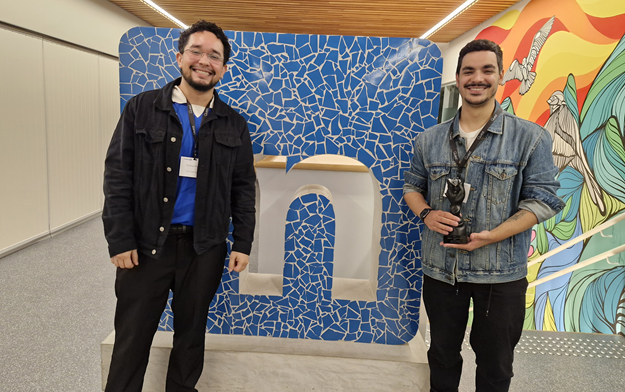
Gerety Awards Celebrates Brazilian Winners at its First-Ever Winners Cocktail in Sao Paulo
The evening recognised five trophies awarded to Brazilian agencies BETC HAVAS and AMPFY

Oct. 22, 2026
AI Movie Awards Reveals 30 Finalists Ahead of London Ceremony
The finalists span categories including Best Short, Best Animation, Best Thriller, Best Sci-Fi, Best Ad, Best Music Video