Leo Burnett Updates Its Branding With Colourful, Modern Twist
Oct. 19, 2017
Leo Burnett has redesigned its visual identity based around the agency’s iconic signature logo with a colourful, modern twist intended to carry the agency through the 21st century … and beyond.
Leo Burnett’ s London-based design team, led by Head of Design Phil Bosher, went back to the agency’s roots to project its core values and symbols of its heritage in a modern and inviting way.
Founded in 1935 and named after its eponymous founder, the agency’s visual identity has long featured Burnett’s signature alongside company symbols such as his distinctive black glasses, big black pencils, and apples.
Burnett used big black Alpha 245 pencils throughout his career – in part inspired when, as a child, he watched shopkeeper father lay out ads for his store on the dining room table – and once commented the big ideas come from big pencils.
When starting his agency during the 1930s recession, Burnett was told by a competitor that he’d be selling apples on the street before he made money in advertising. Apples have been put in reception for staff and clients a symbol of hospitality and success ever since.
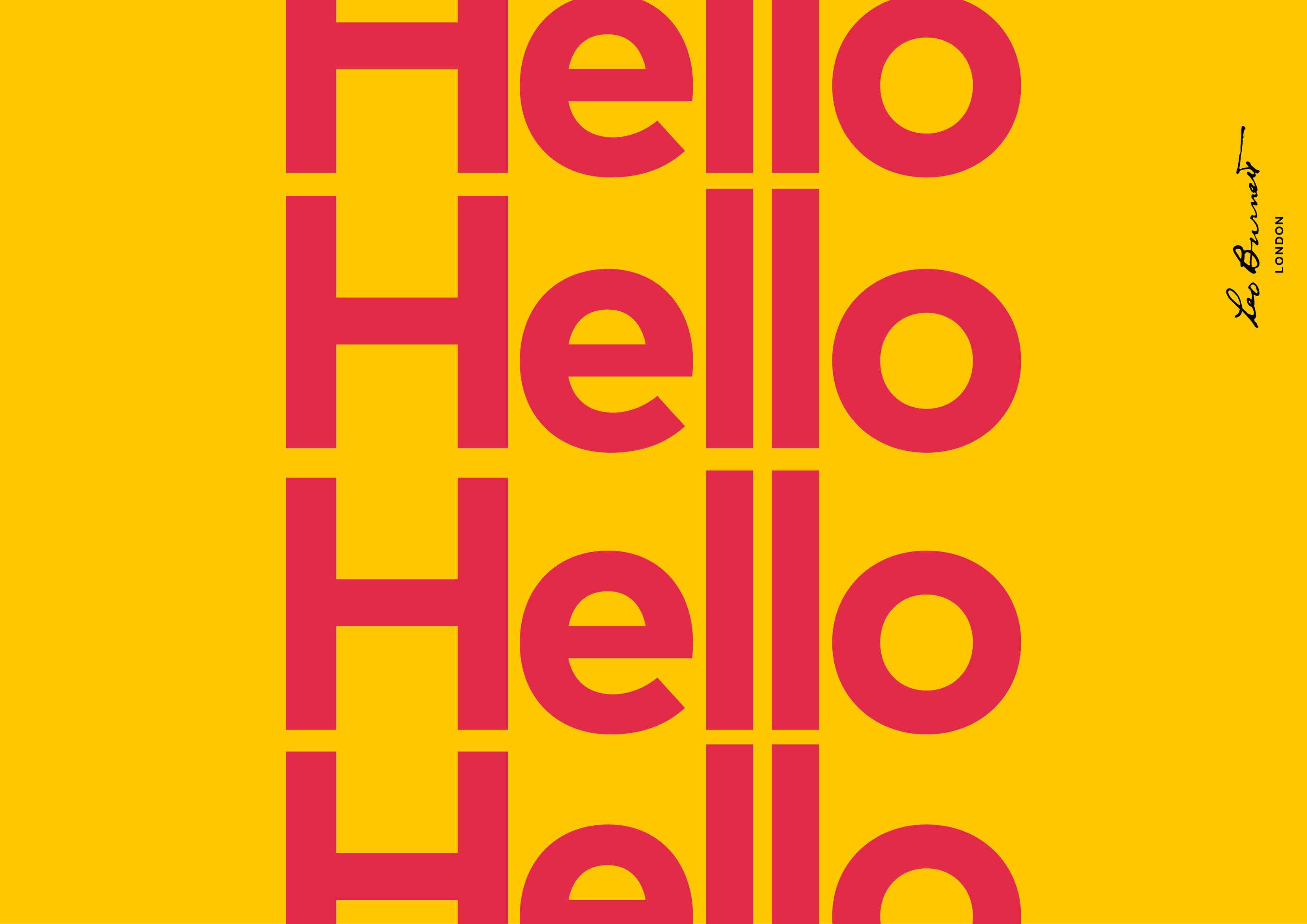
The new visual identity is a fresh and playful reinterpretation or the agency’s core brand elements and features a bold new colour palette and new typeface – FontFont’s geometric sans-serif typeface ‘Mark’.
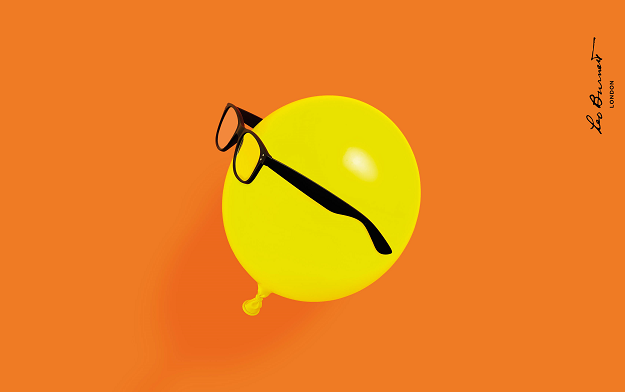
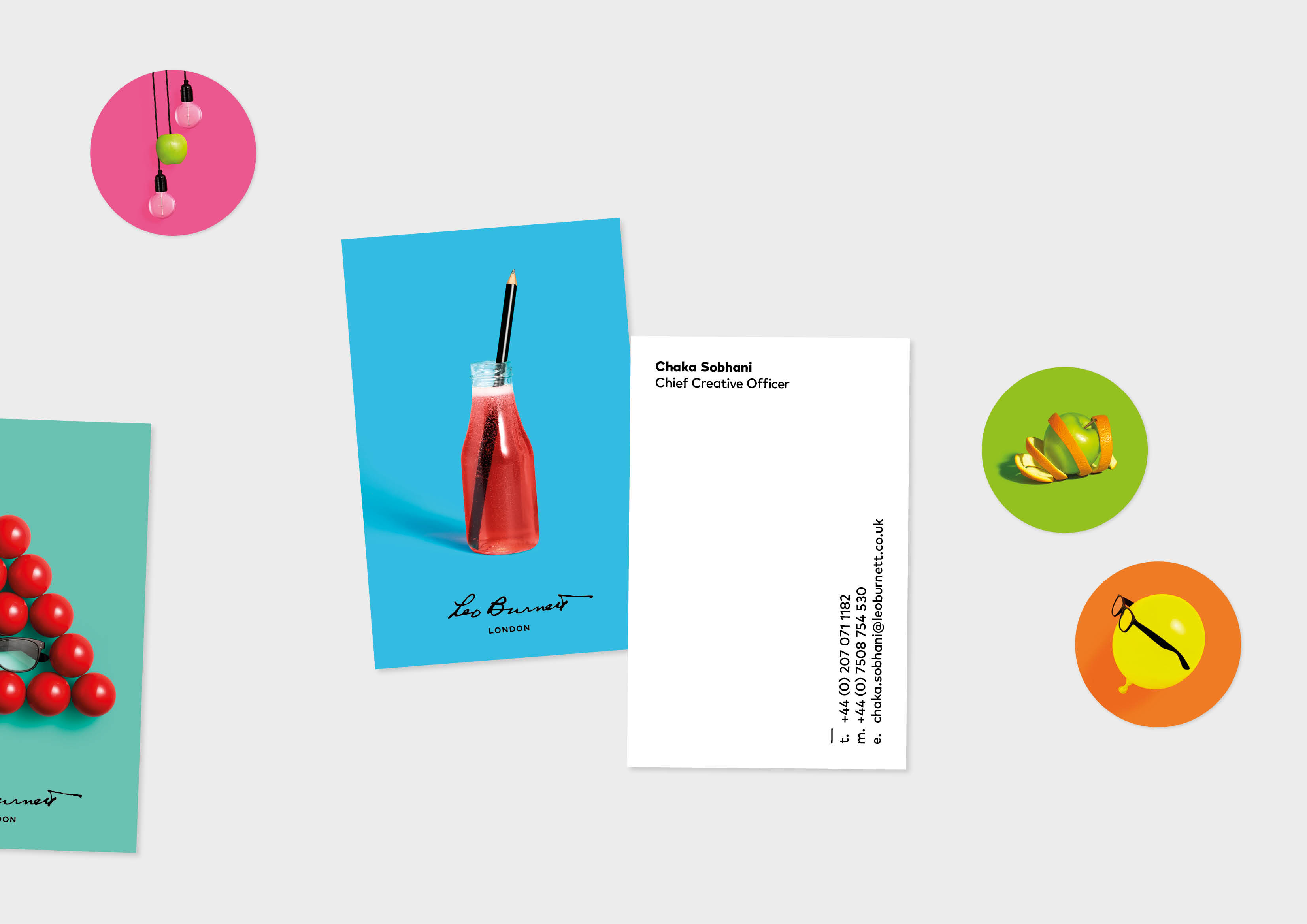
A series of colourful photographic images featuring the iconic pencil, apple and Leo’s glasses have been created to bring to life Leo Burnett’s core values. For example, in one, the distinctive black glasses worn by a yellow balloon. In another, the black pencil leaning in a bottle of drink like a straw.
Mark was chosen for its quirky friendly letterforms n as the perfect complement to the new identity’s contemporary still life photography and colour.
With its broad family of weights and italicised forms, the font is versatile and universally appealing. The result is a bold, modern and engaging visual Identity that’s both welcoming and inclusive.
The new visual identity has been rolled out in the UK via a new website and social channels.


Chaka Sobhani at Leo Burnett London said:
“At Leo Burnett we believe that solving human problems is what makes businesses grow. Put simply, we always want to turn up human and look to make stuff that people truly love.
Our new visual identity needed to reflect this agency philosophy. So we’ve created a simple but more fun, friendly and inviting look that better reflects the personality of the agency and people within it".
The launch of Leo Burnett’s new visual identity follows Leo Burnett’s expansion of its London creative department with a number of new, senior design appointments, instrumental in shaping the new look and feel.
Phil Bosher, who led the redesign of the brand identity, joined recently as Head of Design having worked as a Senior Designer at Mother, CHI & Partners and adam&eveDDB after working as a Designer at Fallon.
Other recent additions to the team include Paul Reddington, a former Senior Designer at Grey London and Adam&EveDDB, and Studio Manager Richard Pettiford. Both Reddington and Pettiford also worked on Leo Burnett’s visual identity redesign.
Related News

McDonald's and Leo UK Put Sauces Centre Stage in "Here for the Sauce" Campaign
The campaign is built on the fan truth that for many McDonald’s customers, the sauce is not the side, it’s the main event. Launching alongside three new sauces

Vodafone Launches its Biggest Ever Brand Campaign "The Nation's Biggest Network"
A future-facing brand campaign from the UK’s biggest network, backed by an £11bn investment

McDonald's launches Shake n' Serve Dipping Experience for Wimbledon
Created by Leo UK, the activation celebrates the fan-favourite fries and milkshake dipping combo

Latest News
Jul. 22, 2026
Havas Strengthens Experiential Marketing Arm, Havas Play, Across Benelux with Acquisition of Dutch Agency SportVibes
Founded in 2003, SportVibes has extensive experience creating connections between fans

Jul. 22, 2026
World Cup Ads Don't Rely on Beckham or Messi as Much as Marketers Think
The stars feature in fewer than 1 in 10 ads, but their presence boosts long-term effectiveness