Scribd Rebrands to Establish Itself as a "Home to the World's Documents" in Global Overhaul by Mother Design
Feb. 27, 2025
Today, Scribd, Inc. has unveiled a new global brand identity for Scribd, the user-powered library - which hosts over 200 million documents in 261 languages for users across 195 countries - as it seeks to propel its growth. The new identity was developed in partnership with independent branding and design studio Mother Design.
In 2023, in the context of a fast-growing audiobook market, Scribd, Inc. separated out its literary content acquired through partnerships with the world’s top publishers, creating digital reading subscription platform Everand to sit alongside user-powered document platform Scribd, and the third brand in its portfolio of products designed to spark human curiosity, presentation platform SlideShare. Mother Design successfully developed the identity for new brand Everand, and has now created a new brand world for Scribd, the company’s original brand.
Founded in 2007, Scribd has long been a valuable resource for information, from teachers searching for classroom resources to industry professionals looking for business plans to hiking enthusiasts hunting for trail maps. But Scribd and the world around it - online and off - have evolved since 2007, and there was a need for its brand identity to evolve accordingly.
With a new sense of energy around the Scribd, Inc. brands, the company asked Mother Design to create a new identity to boost growth and help it modernise and create a brand that feels aligned with the energy and opportunity it offers the world - namely, to democratize information. To achieve this, the studio identified a need to develop a foundational idea that would differentiate the brand and give it cut-through amongst consumers.
Mother Design partnered with Scribd to create a more modern brand, refreshing the customer experience to make it simpler and easier to navigate, while also seeking to increase engagement and loyalty. To that end, the new identity taps into the emotional benefits that Scribd brings to people’s lives, beyond the purely functional, such as learning and enablement.
While other tech companies often default to bright, graphic-inspired heavy identities appealing to Gen Z, Scribd wanted to encourage an environment of research where people can discover everything they wish to know about a topic by diving deeper into its platform. In a digital era of scrolling, editorialisation, and AI-generated summaries, this approach counters the snackable, bite-sized content many of us consume today via hundreds of different online tools and apps. Scribd is the alternative platform for knowledge-seekers who want to do the reading, find the source, or draw their own conclusions.
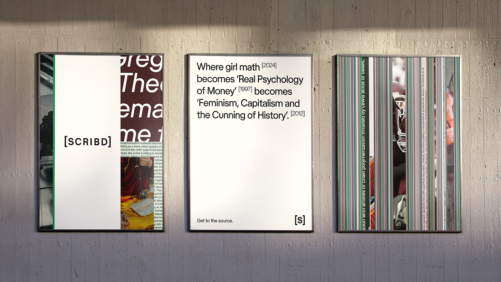
The brand platform, “The Source. Life is an essay, and we are its bibliography,” speaks to the deeper level of learning and understanding enabled by accessing Scribd’s content, rather than surface-level skimming.
Mother Design has reimagined the Scribd brand as a contemporary content catalogue, offering additional, necessary context to life’s ideas and positioning it as the right place to not only learn something but truly understand it and achieve personal growth as a result.
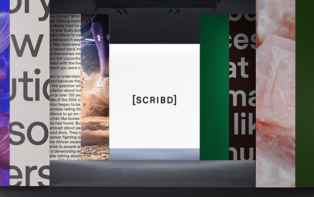
The brand world draws inspiration from physical archives and libraries, visualising the iteration and synthesis of thoughts online, ultimately establishing Scribd as the source for exploration and connection.
The new brand voice is quietly confident and detail-oriented, inviting users to investigate, share knowledge, and foster curiosity. The Scribd wordmark is framed in square brackets, referencing literary source lists and the learning journeys they inspire. With thick, sans-serif letters and wide spacing, it conveys a confident simplicity. In collaboration with Store Norske Skriftkompani, Mother Design developed a modified typeface that incorporates bibliographic symbols, using brackets and superscript to enhance headlines and convey the essence of understanding.
To achieve a feeling of simplicity, the updated colour palette reflects the warmth and tactility of a physical archive, distinguishing Scribd in a digital landscape. It uses green as a consistent, unifying accent to convey optimism, complemented by soft earthy pastels across the user interface. Though refreshed, green has existed in Scribd’s colour palette since its inception, representing a nod to the brand’s roots.
The sense of endless discovery is further expressed through designs reminiscent of turning book pages and stacking documents. Indeed, before beginning the design work, the Mother Design team visited physical archives for inspiration, ensuring the digital brand resonates with its audience through tangible objects and spaces.
The new brand identity is being rolled out across Scribd’s web platform and apps globally, supported by social media and marketing activity. Mother plans to continue collaboration with Scribd, Inc. this year to modernize and rejuvenate the brands in its portfolio
Gemma Craven, VP of Brand Marketing, Scribd, Inc. said:
“We leaned into our successful partnership with Mother Design to honor Scribd's heritage as one of the first wave of internet brands, while celebrating the product's evolution into a fresh, necessary destination for knowledge seekers globally. This new brand identity reflects our mission to democratize the exchange of information, building a digital world of knowledge and interests that rewards users’ curiosity with deep discovery across every topic imaginable.”
Jo Tulej, Creative Director, Mother Design, added:
“Scribd is a tool used by millions daily, with a content library of over 200 million documents. It offers a wealth of information, yet its incredible drive for knowledge sharing and discovery has often been overshadowed by a functional branding approach. In our collaboration with the Scribd team, we’ve created a brand positioning that encourages deeper understanding rather than hot takes, borrowing visual cues from physical archives and libraries. The new identity imagines Scribd as life’s bibliographer—a platform that gives people much-needed context to truly understand the big and small of everyday life.”
Related News
Mindful Chef and Mother Design Bring Joy Back to Healthy Cooking
The refreshed identity strengthens Mindful Chef's point of difference in a crowded category, placing its commitment to health, provenance and quality at the heart of the brand

Slideshare Unveils First Major Rebrand In 20 Years, Led By Mother Design
A revitalised identity repositions the original presentation platform for a new era of global knowledge-sharing
Rollr Partners with Mother Design to Transform Deodorant into a Fragrance-Driven Luxury
Rollr introduces first-of-its-kind luxury fragrance-inspired refillable solution

Latest News
Jul. 21, 2026
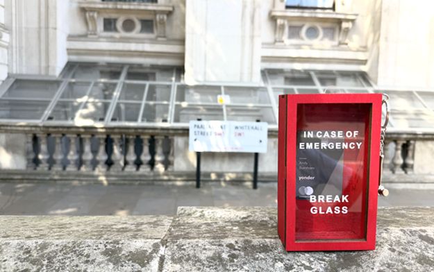
Yonder Delivers new PM a Complimentary Membership as London's Newest Resident
The package included an "in case of emergency, break glass" box for when a reward or two is needed at the end of a stressful day
Jul. 21, 2026
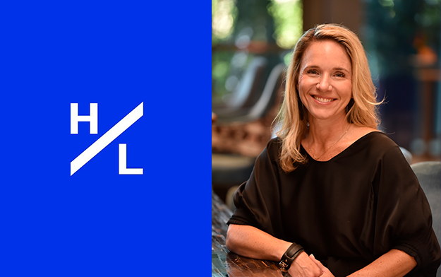
H/L McDonald's Golden Grants Gives Back Over $1 Million In Community Support
Led by EVP Crystal Sawyer, H/L's proprietary program has reached an important milestone