Butchershop Revamp Takes Paddle To Places No Other Payment Software Brand Can Go
Mar. 31, 2022
What happens when you’re more comprehensive than your competitors, but nothing about your brand tells the full story?
You lose.
That's the conclusion the brand transformation team at Butchershop came to when Paddle, a payments software company, tapped the agency to audit their communications. Everything about the brand screamed tax compliance and missed the true distinction – only Paddle gives SaaS companies a complete payments infrastructure that removes all the barriers to selling software globally.
Founded in 2012 as a digital tax compliance solution, Paddle has since grown to simplify software's payment stack altogether. The Paddle platform handles all payment routing, tax collection, compliance, invoicing, subscription management, renewals, reporting, and fraud protection. Yet the brand expression was weighing down growth with clashing aqua colors and a website cluttered with headlines about managing arcane tax situations.
Butchershop found a new premise by exploring all the ways SaaS companies can fail. And then they expanded the focus from Paddle's technology to how it helps all kinds of software companies grow. The result is a rallying cry, "Go there," that morphs Paddle from a tax troubleshooter to a global gateway.
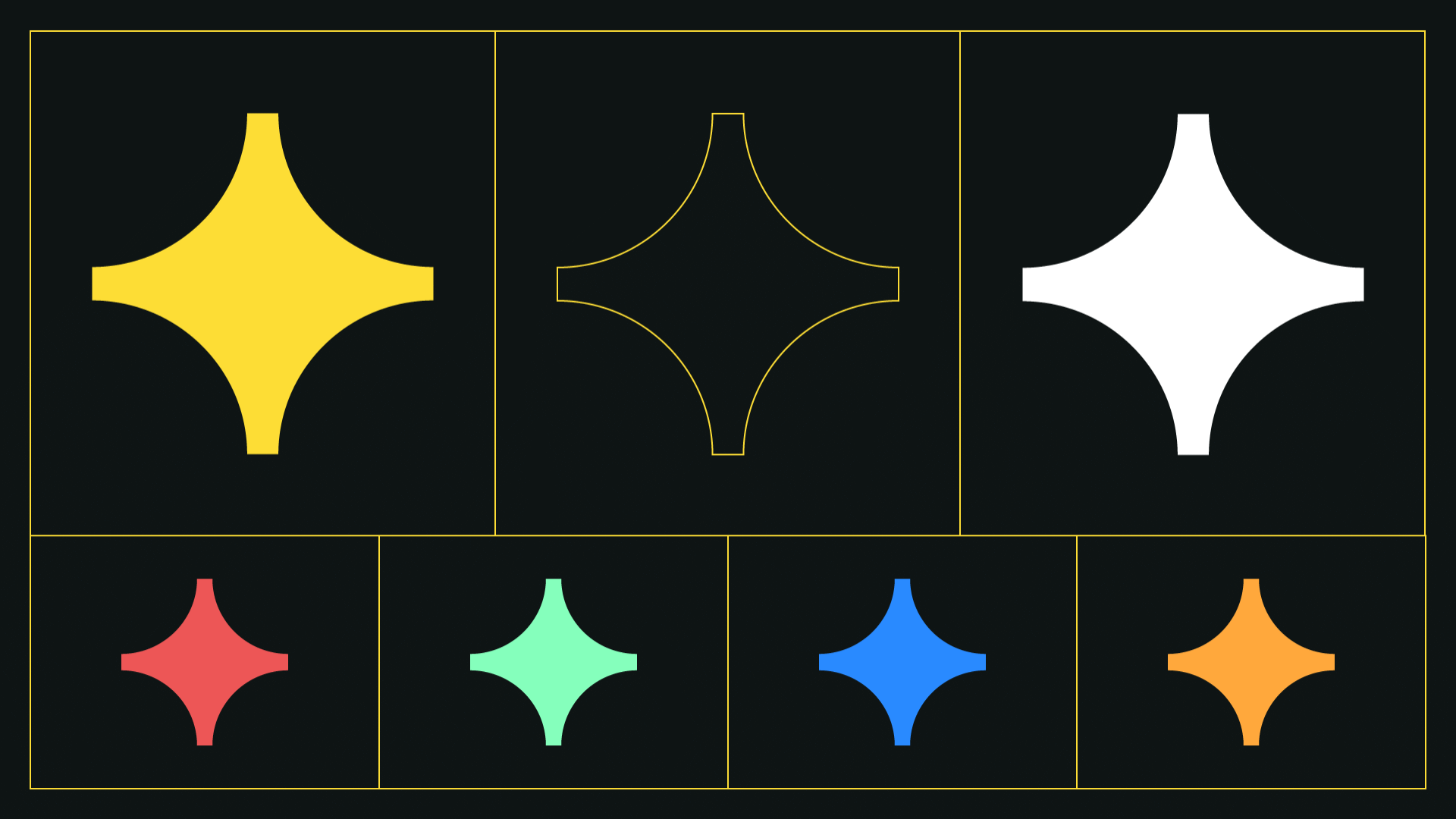
The new logo symbolizes the North Star, suggesting Paddle guides companies to what’s next. The star forms a perfect circular geometry within the P in the Paddle wordmark, giving it a twinkle.
Brand imagery connotes travel into the unknown to suggest the unique places Paddle can take a business. Graphics include maps and badges, symbols of terrain, and a voyage completed to a new destination – all in a style that mimics the metaphorical wonder of Eighties science fiction. Paddle’s in-house illustrators created the images with art direction from Butchershop.
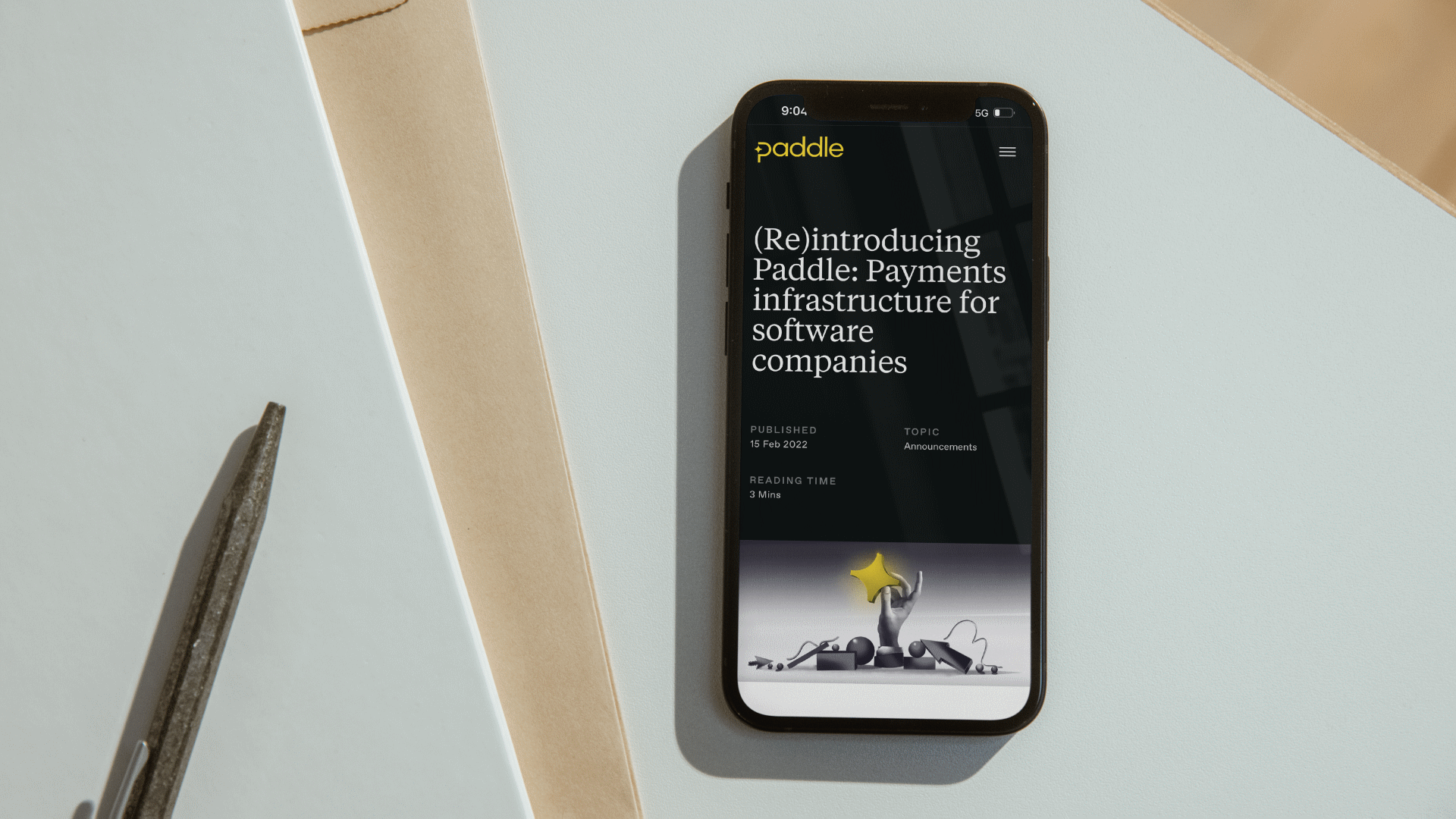
Meanwhile, the brand created by Butchershop was executed by the Paddle team to create a bolder, clearer, and simpler website with yellow and white text on a black background. The design has been incorporated in a series of banner and out-of-home ads with trippy graphics and snappy one-liners such as "we have 67 global bank accounts, so you don’t have to."
The result is a compelling proposition software marketers can feel.

Latest News

Jul. 10, 2026
Gerety Awards Presents: Gerety Talks Advertising Photography
Gerety Talks: Advertising Photography. Tuesday, July 14th
Jul. 10, 2026
Ollie Offers Dogs a "Scent-Sational" Wedding Menu
The dog food brand wants owners to consider their dogs’ dietary needs during their wedding day