Common Good Debuts New Look, Name To Better Convey Expertise In Health And Happiness
Jun. 02, 2022
LRXD has always been a purpose-driven agency. For 55 years, it’s been known as the original health and happiness agency. It was time for a redesign, but not one that strayed from that positioning. Instead, the change needed to convey it in every communication.
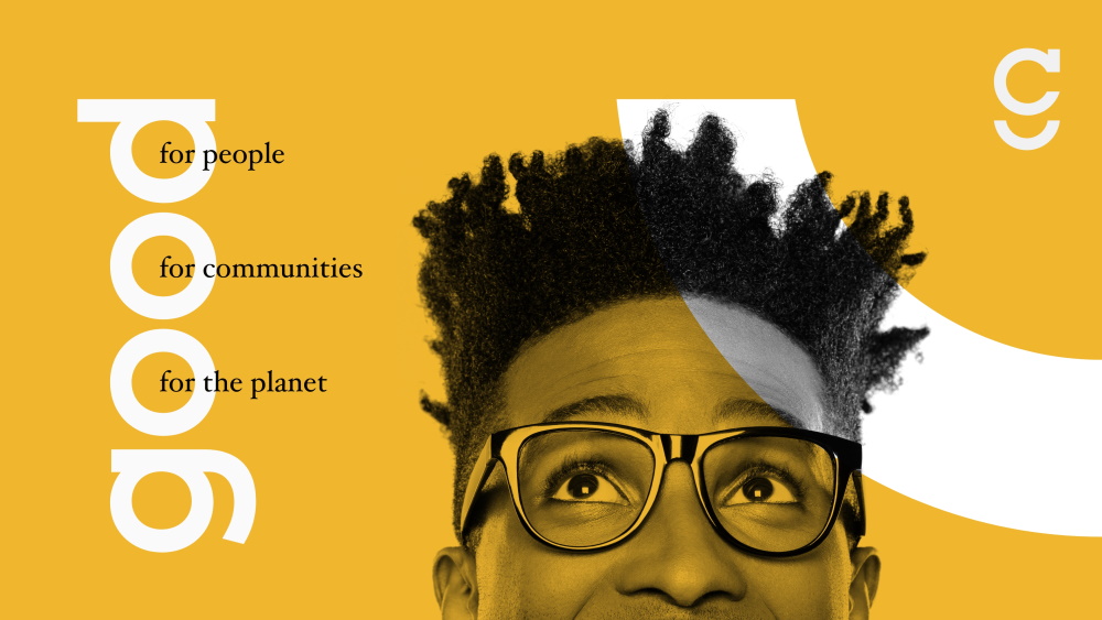
LRXD has now rebranded as Common Good to better communicate its area of expertise, which is uniting people around brands that believe in the betterment of people, their communities, and the planet. Its mission has always been to help people live bigger, better more joyful lives, and an amalgamation of letters did not communicate that. It needed something to quickly convey that it understands the world as it enters a new era of well-care with greater emphasis around a holistic self-care systems, physical longevity, mental health, environmental and community care, and equality.
Partner & CEO Kelly Reedy said:
"We exist to help make the planet healthier and to help people live bigger, better more joyful lives. We work with ambitious brands that do good in the world, but our agency name didn’t reflect that—it wasn’t as telegraphic of our DNA as it could be—so we changed it."
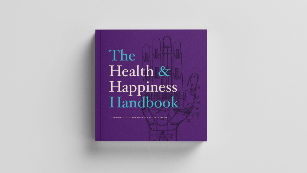
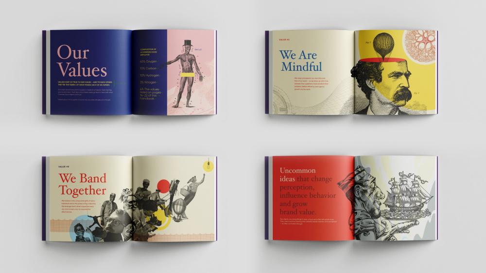
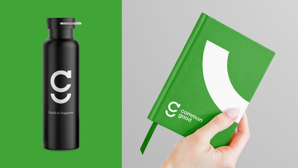
Along with the name change, Common Good set out to redesign its visual brand identity to provide even more clues into signaling its beliefs: Developing a brand identity that represents the new name in a memorable way could get employees, current and prospective clients invested and excited about its evolution. And encapsulating the company's philosophy, mission, and values in a culture book could serve as a north star for its team. Common Good specializes in the design, advertising, experience, and business transformation.
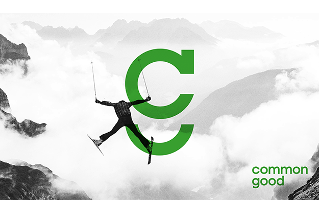
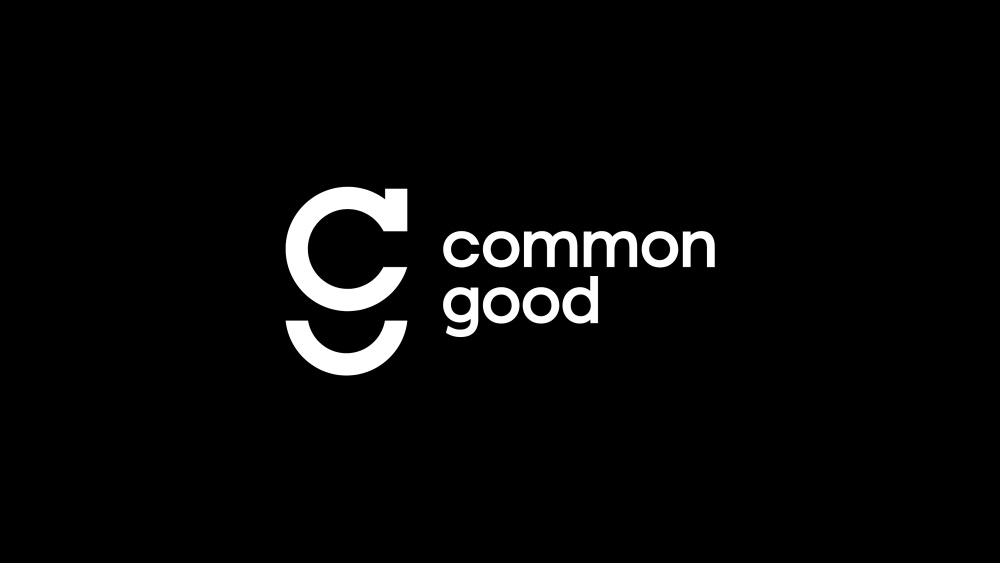
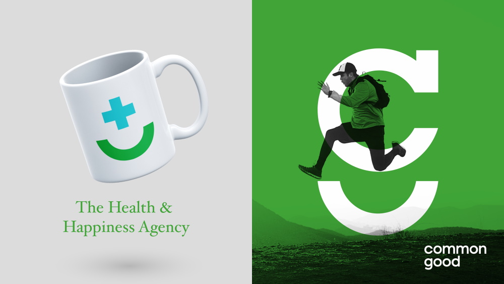
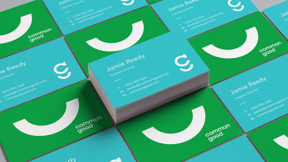
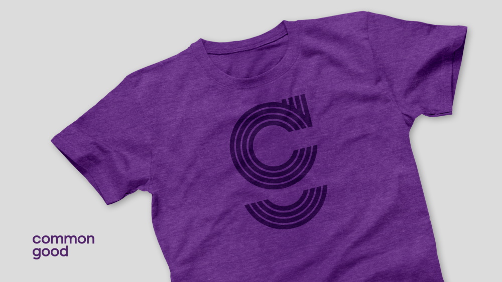
So what does doing good look like? According to the new design, it’s bright, accessible, democratic, and playful. The style centers on bold sans serif type with a friendly, welcoming feel, and simple keystroke icons that represent its health (the + sign) and happiness (a sideways parenthesis smile) attributes. The name common good (written in lowercase) can be used with these icons as a logo; so can the initials, which are stacked to incorporate the c into the g shape, and tag with the smile at the bottom.
The new-look has been applied to the Agency Name, Brand Logo, Color Palette, Typography, and Iconography in all collateral, the Website, a Brand Film, and an Internal Culture Book. And clients seem to approve: Common Good has won 10 accounts in 10 months.
Related News
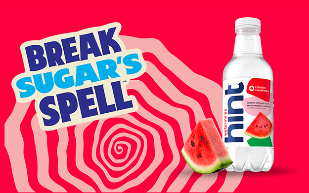
Hint Water Splashes into Summer with Bold New Campaign to Combat Arch-Enemy Sugar
"Break Sugar's Spell" to Run Throughout the 100 Days of Summer
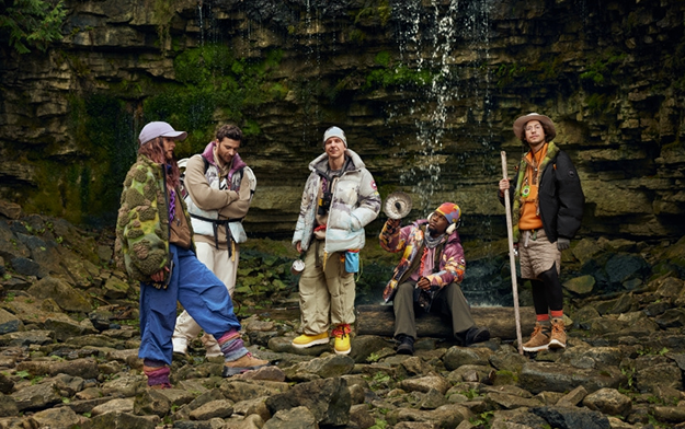
Ad of the Day | Canada Goose x KidSuper x NBA Venture into the Unknown with Shai Gilgeous-Alexander
Common Good's Jamie Webster directs the mixed media commercial, putting a colourful spin on the idea of adventure
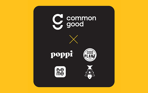
Common Good Secures Four New Accounts for Creative and Media Campaigns
Health and happiness advertising agency Common Good has signed four clients Poppi, BeMe, GOOD PLANeT Foods, and Acme Smoked Fish
Latest News
Jul. 21, 2026
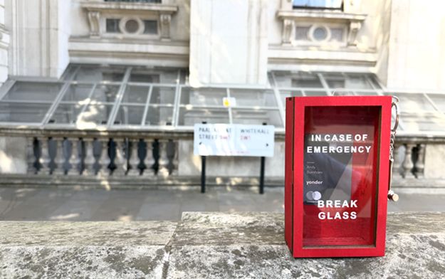
Yonder Delivers new PM a Complimentary Membership as London's Newest Resident
The package included an "in case of emergency, break glass" box for when a reward or two is needed at the end of a stressful day
Jul. 21, 2026
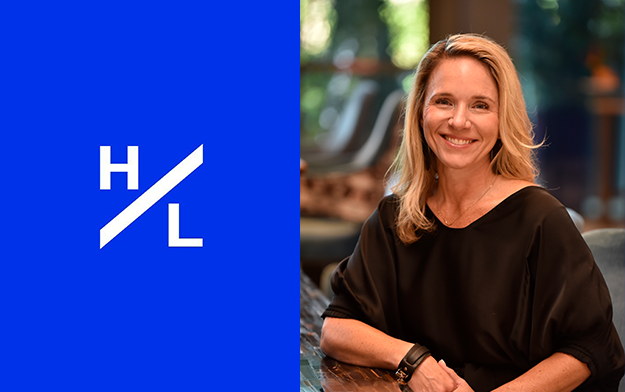
H/L McDonald's Golden Grants Gives Back Over $1 Million In Community Support
Led by EVP Crystal Sawyer, H/L's proprietary program has reached an important milestone