Fuse Group Launches A New Brand Identity Far Beyond The Category Norms
Mar. 01, 2021
As a construction company that has built some of the most complex and exciting building projects in the country, FUSE Group (formerly Liberty Construction Services) wanted to be known as more than just a great builder, they wanted to be recognized as industry trailblazers. The brand required an identity to claim as its own, reflecting its high performing people and reputation for bold, smart building. To answer this ambition, MullenLowe Design created FUSE, from its new name to its bold, daring and electric brand identity, which will launch internally and externally this month.
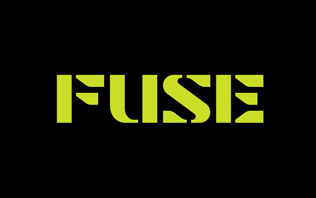
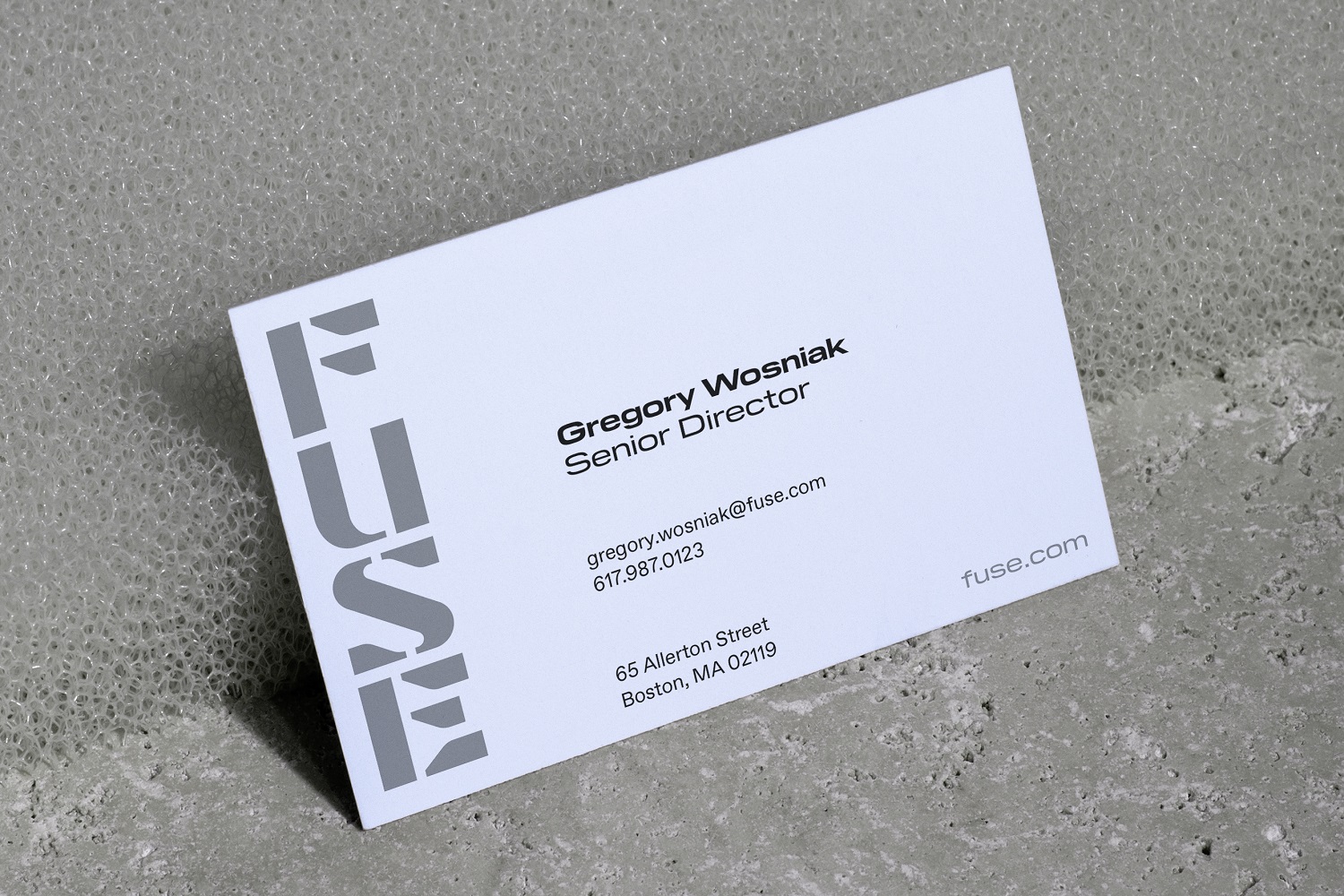
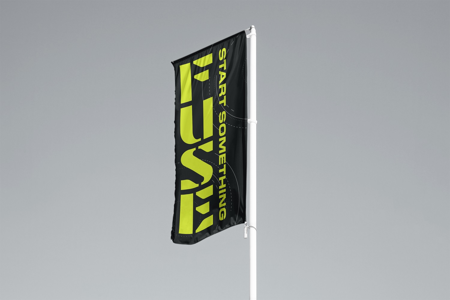
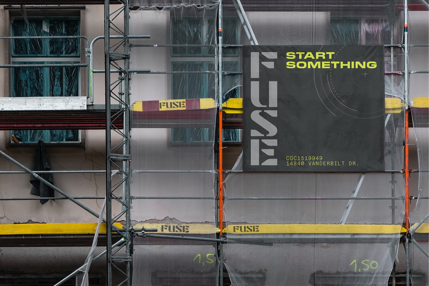
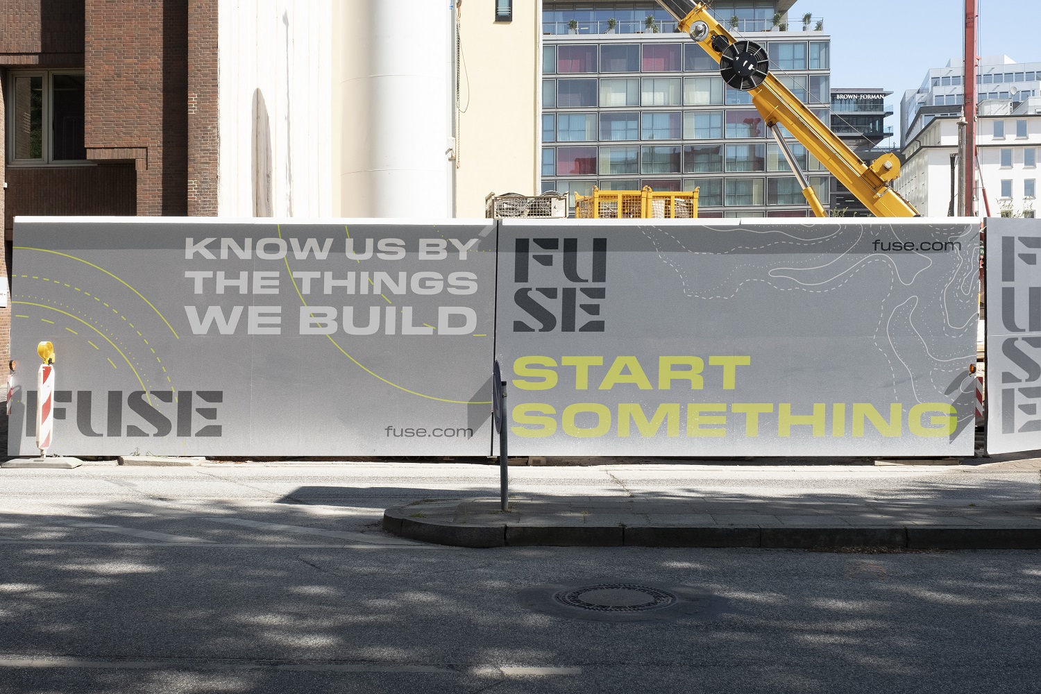
When delving into the culture and purpose of the company to create its new identity, MullenLowe Design was inspired by the core definition of the word fuse: bringing together diverse inputs to distribute fierce energy across spaces. The logo’s bold, “Fusion” a chartreuse, electric yellow combined with its typography, is derived from diagrams found in construction documents, and is deliberately different than typical palettes and identities in the building and construction category. The hero color Fusion is complemented by a neutral color palette, including Infinity, Matter, Odyssey, and Nova.
Chick Fagan, President and General Manager at FUSE, said:
“With its new brand identity, FUSE has the flexibility to establish a strong and clear sense of self that is both unique and tied to the Suffolk family of brands. FUSE’s tight knit teams give us the ability to move fast, unite and spark progress and our new look really projects this image.”
The patterns and graphic elements of the logo design speak to the construction industry (evoking a stencil often seen on the job site) while allowing for unique brand expression. The typography, with Pilat as the hero typeface, is designed with a bold weight and square stance, consistent negative space and angle cuts. The elements of precision are even calculated into the wordmark of the logo, using mathematical formulas to render “FUSE” into a perfect square, vertical, or horizontal lock-up.
Sean O’Brien, Director, MullenLowe Design, said:
“FUSE’s brand identity perfectly combines the elements of building with its active and electric culture. Their new look is not unlike a sports performance brand and is a major departure from anything you’ll see on a construction site or in an office. We are confident that the new company image will galvanize a sense of pride and forward-thinking, whether worn on a jacket, presented to client or signage on a jobsite.”
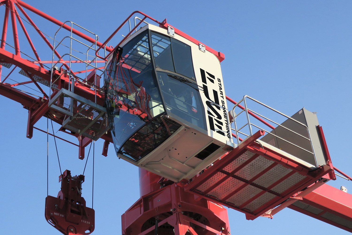
FUSE’s tagline, “Start Something” channels the company’s commitment to transforming the construction experience and its spirit of revolutionizing an industry. It’s strong mission statement: “Know us by the things we build.” echoes its “can-do” attitude that permeates its culture and ethics.
Related News

Studio Private Brings Boldness and Precision to Daniel Sannwald's Seamless Calvin Klein Spring 2026 Campaign Images
Studio Private collaborated closely with Sannwald on the retouch of the campaign stills

A Brand That Never Sleeps - Span's Brand Pulsates 24/7
Span, an IT company, has built its identity around a dynamic, real-time display of security alerts and support requests, emphasizing its commitment to continuous client care and protection from cyber-attacks

Scottish Government Shines a Light on Mental Health Resources in Nationwide Marketing Campaign
Campaign features striking neon signs in Glasgow and Edinburgh train stations

Latest News

Jul. 24, 2026
Under Armour Celebrates the Off-Season And Invites Football Stars to Five-Star Resort
"Rest Less" campaign from MOX features players with no chill

Jul. 24, 2026
Leo UK and Skoda Put the "Shhh" into Skoda in Nationwide Campaign
Building on Skoda's playful brand platform, the campaign transforms the hacek above the S into a creative device